Written by: Igor
Published: December 2025
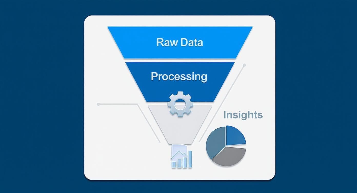
Big data is often a big mess. Without the right tools, it’s just noise trapped in massive, complex datasets, offering zero business value. The solution is effective data visualization for big data, which turns that noise into clear patterns, trends, and outliers you can actually act on. This isn’t about making pretty charts-it’s about making your data work for you.
In this guide, you'll learn the practical steps to build scalable, responsive dashboards. We'll cover the back-end architecture, the right tools for the job, and the design techniques that make insights jump off the screen.
Snapshot
- Build a layered architecture: Separate data ingestion, storage, processing, and serving to ensure your dashboards are fast and responsive, even with billions of records.
- Choose tools wisely: Select BI platforms, open-source alternatives, or custom libraries based on your team's skills, budget, and speed-to-insight needs.
- Visualize smarter, not harder: Use techniques like aggregation, sampling, and density plots to make massive datasets understandable without crashing your browser.
- Focus on user adoption: Establish a single source of truth and design for a great user experience to ensure your team trusts and uses the dashboards you build.
Why visualizing big data is a business imperative
Collecting data isn't the hard part anymore-it's making sense of it. Many founders and operators are sitting on a goldmine of information, but it’s useless without a way to interpret it. This is where data visualization for big data becomes a fundamental necessity, turning raw numbers into a real competitive advantage.
Moving beyond spreadsheets and static reports
Let's be direct: traditional reporting tools can't handle this scale. Trying to crunch millions of records in Excel is a recipe for crashed computers and missed opportunities. Static reports are often outdated the moment they land in your inbox, giving you a rearview mirror perspective when you need to make decisions now.
Good visualization provides a dynamic, interactive way to explore your data. Imagine a retail company analyzing millions of daily transactions. With a visual dashboard, they can instantly spot critical insights:
- Which products are trending in specific regions?
- Where are supply chain bottlenecks appearing?
- How are customer buying habits shifting week over week?
Finding these answers would take a team of analysts days of manual work. On a well-designed dashboard, it takes minutes. The global big data market was valued at over $270 billion in 2022 and is expected to grow at a compound annual growth rate (CAGR) of 13.5% from 2023 to 2030, according to Grand View Research. This growth highlights the urgent need for tools that make data useful.
A great dashboard doesn't just give you answers; it prompts you to ask better questions. By the end of this guide, you'll have a clear roadmap for turning your organization's data into its most valuable asset.
Building an architecture for real-time insights
A slick dashboard is useless if it’s slow, unresponsive, or crashes under the weight of your data. The secret to fast, interactive data visualization for big data isn't a front-end trick; it’s engineered in the back-end architecture. Get this right, and your team can explore massive datasets in real time-not wait minutes for a single chart to load.
Let's lay out a practical roadmap for a system that can handle huge data volumes. The goal is a modern, layered architecture that makes your visualizations instantly responsive.
This is the high-level flow we're aiming for. A modern stack is typically broken down into a few key layers, each with a specific job.
Core components of a scalable data visualization stack
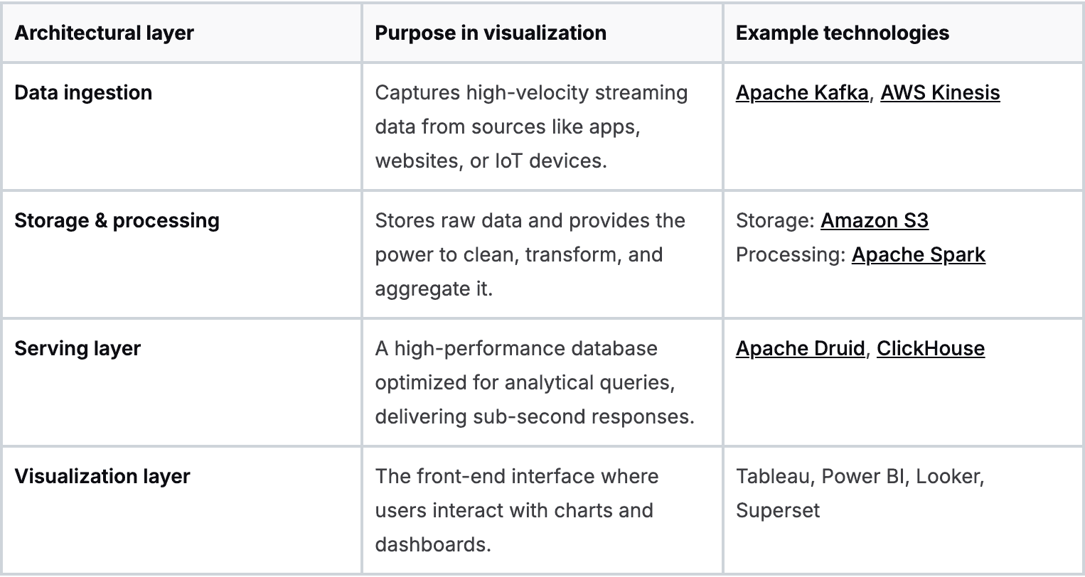
Each layer builds on the last, creating a fast and resilient pipeline.
The ingestion layer
First, you need to get data into your system efficiently, especially for real-time updates. This is the job of the ingestion layer. Think of it as the main entryway for all your raw data streams.
Tools like Apache Kafka or AWS Kinesis are built for this. They act as a buffer, reliably capturing every piece of data without loss, even during massive traffic spikes.
The storage and processing layer
Once the data is in, it needs a place to live and be refined. The storage and processing layer combines a data lake and a processing engine.
A data lake (like Amazon S3) is a cost-effective place to store vast amounts of raw data. To make that data useful, you need a powerful processing engine like Apache Spark. Spark is where you run complex transformations, clean up messy data, and perform large-scale aggregations.
The serving layer
Now for the layer that makes or breaks your dashboard's performance. The serving layer is a specialized, high-speed database designed to answer analytical queries in milliseconds. It sits between your processed data and your visualization tool.
Your traditional relational database wasn't built for this. For big data analytics, you need a columnar database like Apache Druid or ClickHouse. Unlike row-based databases, columnar databases store all values for a single column together. For an analytical query like "find the average purchase price," this is exponentially faster because the database only reads the single 'price' column. This choice alone can make dashboards 100x faster.
The secret weapon: pre-computation
The magic behind sub-second dashboard responses isn't just a fast database; it's pre-computation. Instead of forcing your dashboard to calculate complex metrics on the fly, you do the heavy lifting ahead of time.
Here’s what that looks like in practice:
- Define key metrics: Identify the most common questions your users will ask, like daily active users or total revenue by region.
- Schedule aggregations: Set up a recurring job (using Spark, for instance) that calculates these metrics at regular intervals.
- Store the results: Save these pre-computed summaries in your serving layer database.
When a user opens the dashboard, it queries these small, pre-aggregated tables instead of the raw, multi-billion-row dataset. You're shifting the workload from query time to ingestion time, ensuring your users get answers instantly.
How to choose the right visualization tools
Once you have a solid architecture, it’s time to pick the software that will bring your data to life. The world of data visualization for big data tools breaks down into three main categories, each serving a different need.
Business intelligence platforms
These are the all-in-one, off-the-shelf solutions like Tableau, Microsoft Power BI, or Looker. They come with polished, drag-and-drop interfaces that make it simple for non-technical users to build dashboards.
- Best for: Teams that need to move fast and get standard dashboards up and running quickly.
- Key trade-off: You’re trading control for convenience. These tools can get expensive and may be difficult to integrate with a custom data stack.
Open-source alternatives
Tools like Apache Superset or Metabase offer a cost-effective alternative to commercial platforms. They provide much of the same core functionality without the license fees.
- Best for: Companies with in-house technical talent who want more control without starting from scratch.
- Key trade-off: The total cost of ownership isn't zero. You'll need to invest engineering resources into setup, maintenance, and scaling.
Custom JavaScript libraries
For ultimate control, you can build your visualizations from the ground up using libraries like D3.js, Plotly, or Highcharts. This path means writing code to create every single chart and interaction.
- Best for: Data-mature companies embedding analytics directly into customer-facing apps.
- Key trade-off: This is the most resource-intensive option, demanding a dedicated team of skilled developers and a much longer development cycle.
A decision-making framework
Picking the right tool is about matching it to your business reality. The global data visualization market is projected to reach $19.2 billion by 2027, according to a report from Forbes, showing how critical this capability has become.
Here’s a simple way to frame your decision:
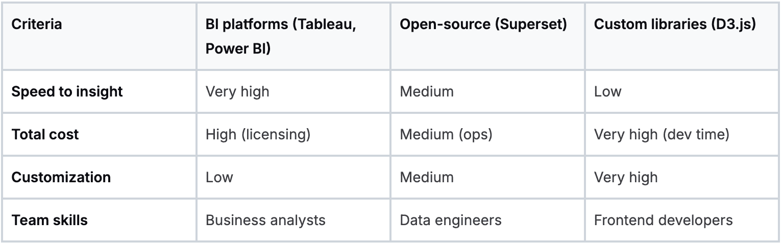
Your choice comes down to balancing speed, cost, and control. Understanding these trade-offs is key to avoiding common AI implementation challenges and ensuring your visualization stack can grow with your business.
Practical techniques for visualizing massive datasets
You can't just dump a billion data points into a scatter chart and expect it to work. The fix isn't a more powerful server; it's a smarter approach to what you show. To make massive datasets coherent and performant, you must embrace techniques that summarize information intelligently.
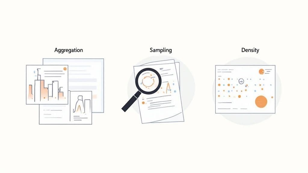
From raw data to meaningful summaries
The goal is to reduce the number of data points your tool has to render without losing the story. Three techniques are indispensable here.
- Data aggregation: This is your workhorse. Instead of plotting every single transaction, you show total sales per day. Aggregation shrinks data volume while surfacing the trends that matter.
- Sampling: If you need to see the shape of the data, sampling is your friend. Rather than plotting 100 million user sessions, you can plot a statistically significant random sample of 100,000. This smaller subset often reveals the same patterns but loads in a fraction of a second.
- Density plots: Overlapping data points turn a busy scatter plot into a blob. Density plots-like heatmaps or hexagon binning charts-group points into bins and use color intensity to show concentration. A chaotic cloud of dots becomes a clear visual pattern.
A simple workflow for creating a new dashboard
Every great dashboard starts with a business question, not a dataset. Without a clear goal, dashboards become a graveyard of pretty but useless charts.
Here's a quick checklist to get from idea to a useful visualization:
- Define the business question: Get specific. "How is our user engagement trending week-over-week?" is a powerful start.
- Identify the key metrics: What numbers answer that question? For engagement, it might be Daily Active Users (DAU), average session duration, and feature adoption rates.
- Choose the right visualization: Match the chart to the job. Line charts show trends over time. Bar charts compare categories.
- Implement performance techniques: Pre-aggregate your daily active users in the data warehouse so the chart loads instantly. Use a heatmap to visualize where users are clicking.
Many of these insights, especially in finance, can be automated. You can discover more about how AI transforms finance teams through automated reporting in our related article.
Driving adoption with governance and great user experience
You can build the most technically brilliant system, but it's only half the battle. If your team doesn't trust the data or finds the dashboards impossible to use, your investment is at risk. Getting the organization to actually rely on your new tools is where governance and user experience (UX) become mission-critical.

The single biggest threat to adoption is a lack of trust. Nothing kills a data initiative faster than two departments showing up to a meeting with conflicting numbers from the "same" source.
Establishing a single source of truth
To build trust, you must establish a single source of truth. This means creating a clear distinction between raw data and clean, validated datasets certified for business use.
Here’s how to get it done:
- Create certified datasets: Designate specific tables in your data warehouse as the "golden" sources for key domains like sales or finance.
- Develop a data dictionary: Document every field in those certified datasets. Define what each metric means and how it's calculated.
- Implement data lineage: Use tools that let you visually track data from its origin through every transformation to build confidence in the numbers.
Designing for a great user experience
Once people trust the data, the next hurdle is making it easy to find answers. A clunky UX can make even the fastest dashboard unusable. The most common mistake is overwhelming users with a wall of charts.
Smart filters and progressive disclosure
Don't show everything at once. Use progressive disclosure. Start with a high-level summary and provide clear paths to drill down into more detailed views. Combine this with smart filtering that is relevant to the user's context. Small UX details like this make a massive difference in adoption.
Monitoring for performance and reliability
Finally, adoption isn't a one-time task. You have to ensure the system stays fast and reliable. Performance is a core feature of the user experience.
Implement basic monitoring to track dashboard load times and query performance. Set a performance budget-for example, "all primary dashboards must load in under five seconds." If performance degrades, it's a clear signal that a query needs tuning.
So, where do you go from here?
We've walked through the entire process, from strategy and architecture to the tools and techniques that get your team to actually use the data. The firehose of data isn't slowing down, which means turning that raw information into clear visuals is no longer a "nice-to-have"-it's essential.
The best place to start is with an honest review of where you stand today. Our guide on conducting an AI readiness assessment is a great resource for structuring that process.
Ask yourself: what's the single biggest point of friction in our data process right now? Is it slow dashboards? Reports that fail to deliver actionable insights? An old architecture that can’t handle the load? Pick one, and start there.
By focusing on one problem first, you can begin to systematically improve how your organization uses its data. The goal is to shift your mindset from data visualization for big data being a technical challenge to it becoming your sharpest competitive edge.
We at N² labs can help you design and build the high-performance visualization platforms that unlock that value.
FAQ
The biggest challenge is performance. Traditional dashboards and databases weren't built to handle billions of rows, leading to slow or crashing visualizations. The fix requires a back-end architecture with a fast serving layer (like Apache Druid or ClickHouse), pre-aggregation of data, and efficient visualization patterns like heatmaps.
This decision balances control against cost and scalability. Cloud tools like Power BI or Tableau Cloud are practical for most companies, offering lower upfront costs and easy scaling. On-premise solutions provide maximum control over data security, which is critical for heavily regulated industries, but come with higher capital and operational expenses.
Look beyond flashy charts and focus on core capabilities. Key features include native connectors to high-performance databases like Snowflake or BigQuery, support for "live" or "direct" query modes that push processing to the database, and robust governance features like row-level security and certified dataset workflows.
AI acts as a co-pilot in two ways. First, it automates insight discovery by identifying anomalies and trends a human might miss. Second, it powers natural language query (NLQ), allowing non-technical users to ask questions in plain English and receive instant visualizations. This lowers the barrier to data exploration and fosters a data-driven culture, an accelerating trend confirmed in reports like the one from McKinsey shows just how widespread AI adoption is becoming.